Chronicle
Overview
Overview
For our final in UI/UX Design, we embarked on a project to design a digital application to bridge generations. We began by conducting user experience research. Then we created grayscales before making a style guide and adding color. After we developed our initial Figma prototype we conducted user testing. We made revisions based on feedback and then presented our final design at Dartmouth’s Technigala.
Class
COSC 25.01: UI UX Design
Timeline
April - June 2022 (3 weeks)
Tools
Figma, UX Research
Process
Shedding more light on the generational divide
We conducted sociological, quantitative, and qualitative research on the differences and similarities between four key generations: Baby Boomers, Generation X, Millennials, and Generation Z. We found that Boomers as a whole tend to use technology to help create their desired lifestyle rather than allowing technology to shape their whole existence. Generation Z has grown up with digital technology their whole lives and tend to learn more through direct observation and active hands-on participation.
Our challenge was to create an interface that adapted to the needs and expectations of two vastly different generations with stark contrasts in technological literacy.
This lead us to our three design specifications
1. Accessible
We want our interface to be accessible to users of all age groups, as well as for those with color vision deficiency
2. Delightful
We strive to bring users an effortless sense of delight and joy, capturing the essence of childlike wonder
3. Intuitive
For our target audience of grandparents and grandchildren, we want our user flows to be intuitive and frictionless
User Experience (UX) Research
Who should we make sure to consider during the design process
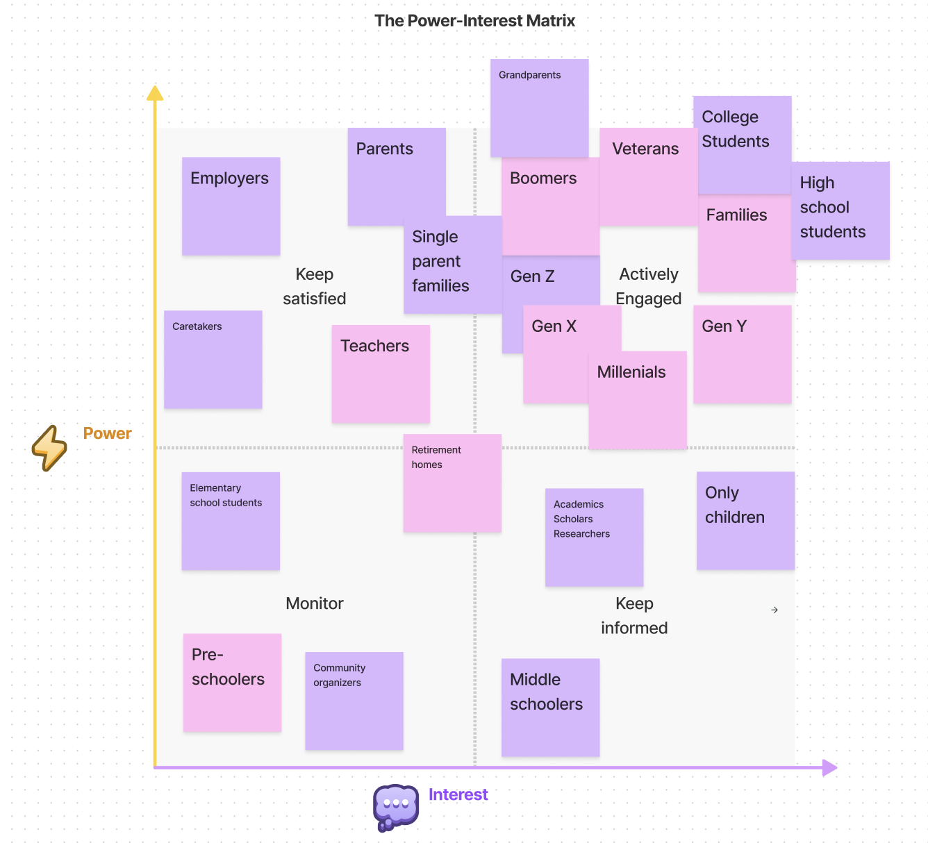
We started by creating a stakeholder matrix to better visualize the people and organizations involved in intergenerational communication.
Stakeholder Map based on Power and Interest
Who we spoke to and what we learned
While ideating solutions, we initially focused on a digital app that would connect students who needed qualitative research/interviews for school projects and paper with older generations who could tell their personal stories and experiences. We were drawn towards this solution at first because we thought we were harnessing two generations’ needs for mutual benefit: 1) younger generations need to hear personal stories of big historical events from older people and 2) older generations who wanted to pass down stories and insights from their life to younger people.
However, after we conducted our user interviews, we realized that we had to pivot and come back to the drawing board. Targeting groups from our stakeholder matrix, we held four user interviews with two Boomers and two Gen Z’s. From our user interviews, we gathered a few key takeaways:
1. Privacy
Grandparents are not inclined to share stories with strangers
2. Family
There is something special about sharing stories within a family
3. Engagement
Kids often get distracted when listening to stories unless the story is very engaging
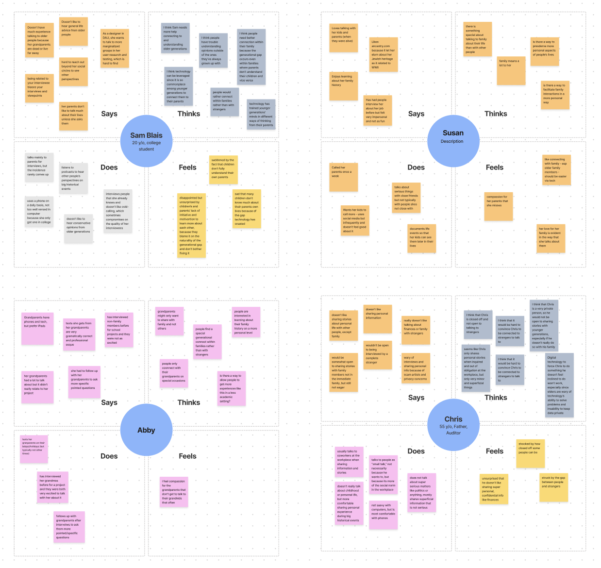
We then created empathy maps so that we could better understand and empathize with our users.
Empathy maps for our four user tests
Who are our users
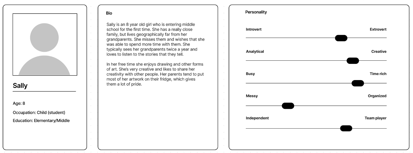
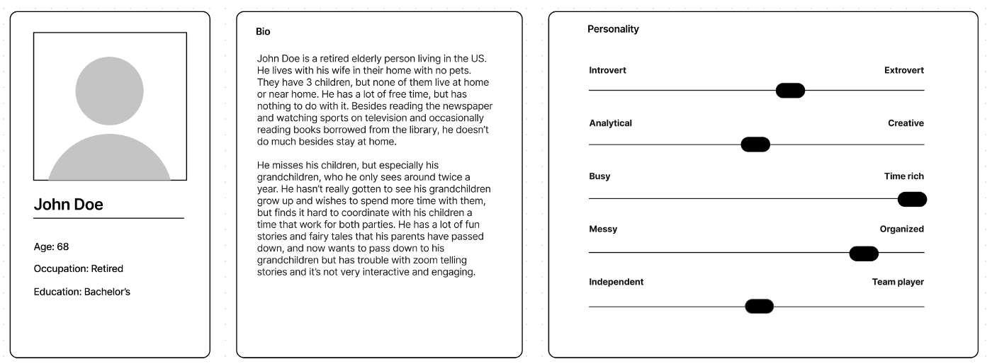
Based on our user interviews, we also created user profiles for our two target user groups. This helped us solidify and concretize the needs, expectations, and motivations of our users.
We also identified pain points for each of our user groups in currently connecting with and understanding other generations.
User profile for Generation Z
1. Quality Time
Children crave quality time with their grandparents, who generally don’t live with them at home
2. Attention
Kids have short attention spans and need a product that captures, engages, and maintains their attention
3. Relating
Children find it difficult relating to their grandparents and starting and maintaining conversations with them
User profile for Boomers
Refining the scope and brainstorming solutions
Based off of our UX research, we formulated our final how might we question:
How might we help connect generations within families?
After we finalized our how might we question, we brainstormed solutions and categorized them based on how feasible and original they are.
2 x 2 for potential solutions to our how might we question
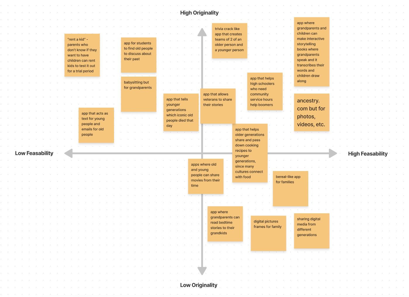
We ended up going with the most feasible and original solution we came up with: a tablet app where grandparents and grandchildren can make collaborative digital stories where one person records the pages of the story and the other draws illustrations for it.
User Interface (UI) Design
How does the user navigate the app
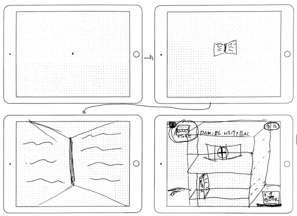
When making our sketches we made sure to keep in mind our design specifications. We consistently iterated on our greyscales to make the best design possible.
Throughout our design process, we would revisit the Designer’s Critical Alphabet to ensure we were designing for groups typically excluded from the design process. Keeping this in mind during the process manifested itself in several ways:
Large Buttons
We used large buttons to make our app more accessible towards younger users (who might not have fully developed hand-eye coordination) and older users (who might have visual impairments and/or fine-motor limitations).
Icons
We used icons and illustrations when possible in conjunction with text to make our app more accessible towards people that have dyslexia or other reading disabilities.
AAA Accessible Text
We wanted to ensure that our app was accessible to the highest degree
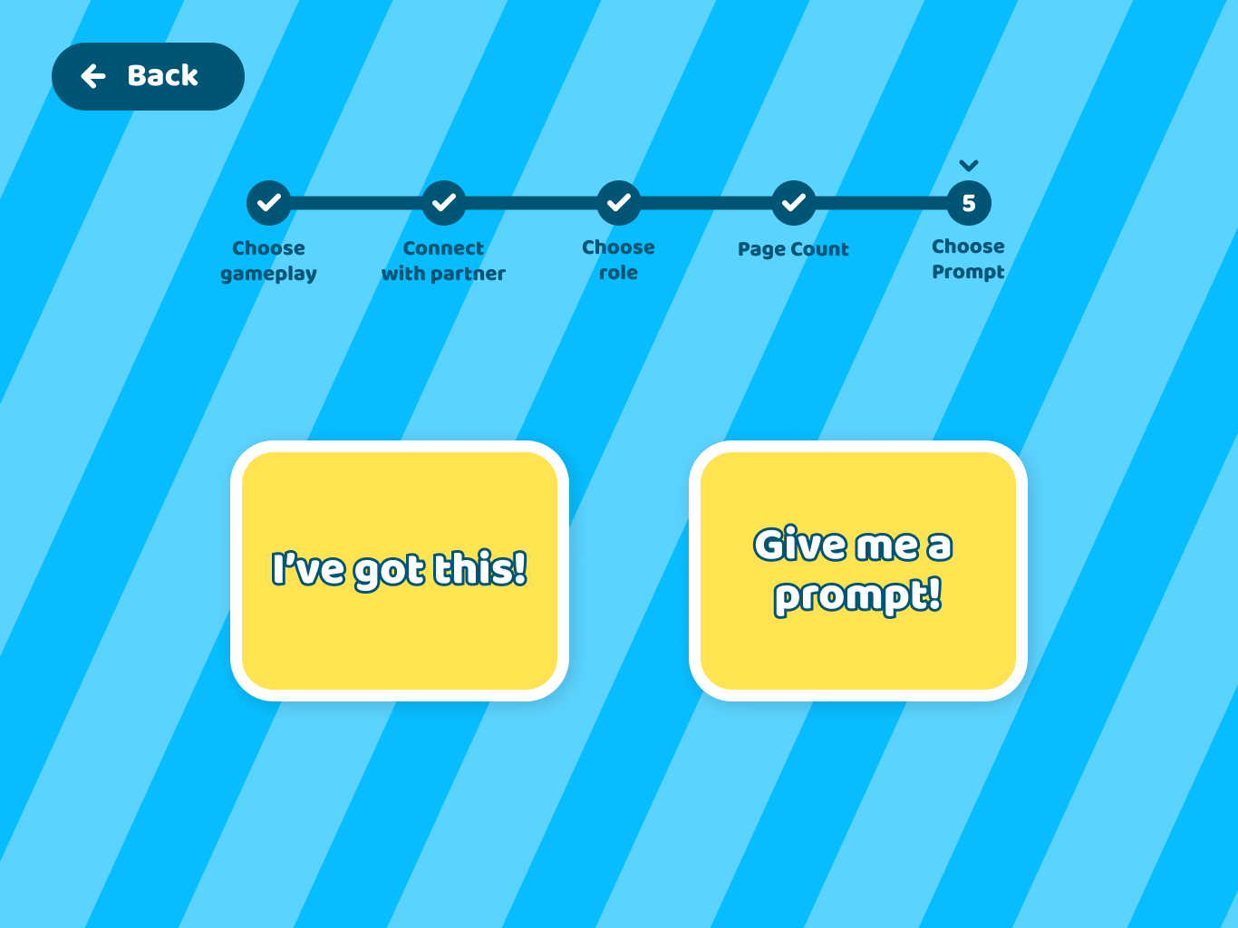
We started off by developing a user flow:
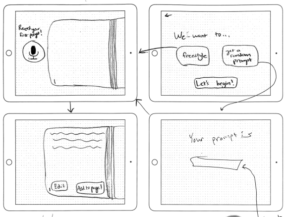
The app begins on the landing page.
Empty state and landing flow
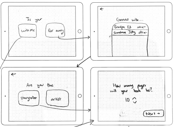
From there, they can create a new book and choose whether their partner is with me or far away. While our app is primarily made for grandparents and grandchildren who are disconnected by large physical distances, we wanted to create a flow for those who are on the app together.
For partners who are far away from each other, users connect with their partner through audio. We wanted our users to be able to talk to each other over the app so the artist who illustrates the story can ask more questions and hold a conversation with their partner.
From there, users choose whether they will act as the storyteller or the artist for the story. Our primary thought was to have grandparents be the storyteller since this app functions to allow older generations pass down stories to their grandchildren and grandchildren be the artist since young children tend to be more creative, free-flowing with ideas, and artistically inclined. However, we wanted to give users the option to choose their roles to give them more freedom and allow children to tell stories of their life to their grandparents.
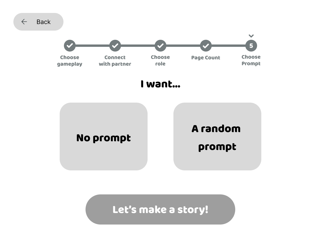
When users choose the storyteller flow, they can choose whether they want the app to give them a randomized prompt if they have no stories at the top of their head that they want to tell. We decided to imitate a casino machine spinning to spit out a prompt for users to give a feeling of delight, excitement, and anticipation in getting a prompt, but we also gave users the option to spin again in case they didn’t like the prompt they initially got. We also give storytellers the option to write a story if they have one in mind already.
Setting up the story flow
If users choose the artist flow, they can talk with their partner to decide on these, but we ultimately left it up to the storyteller because they would know more about the story they want to tell.
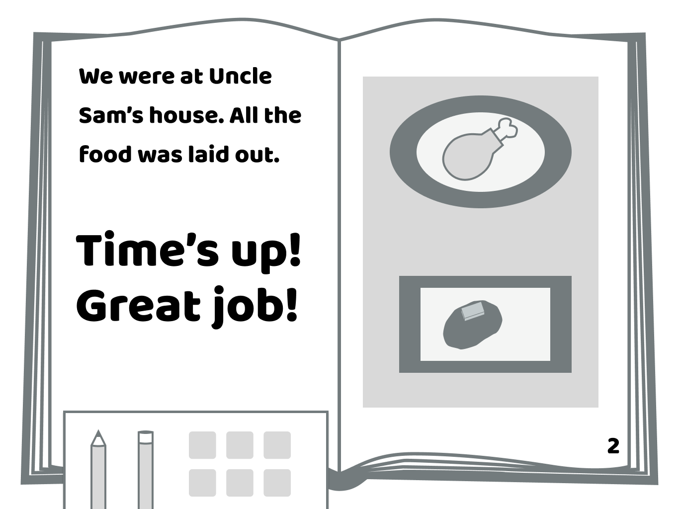
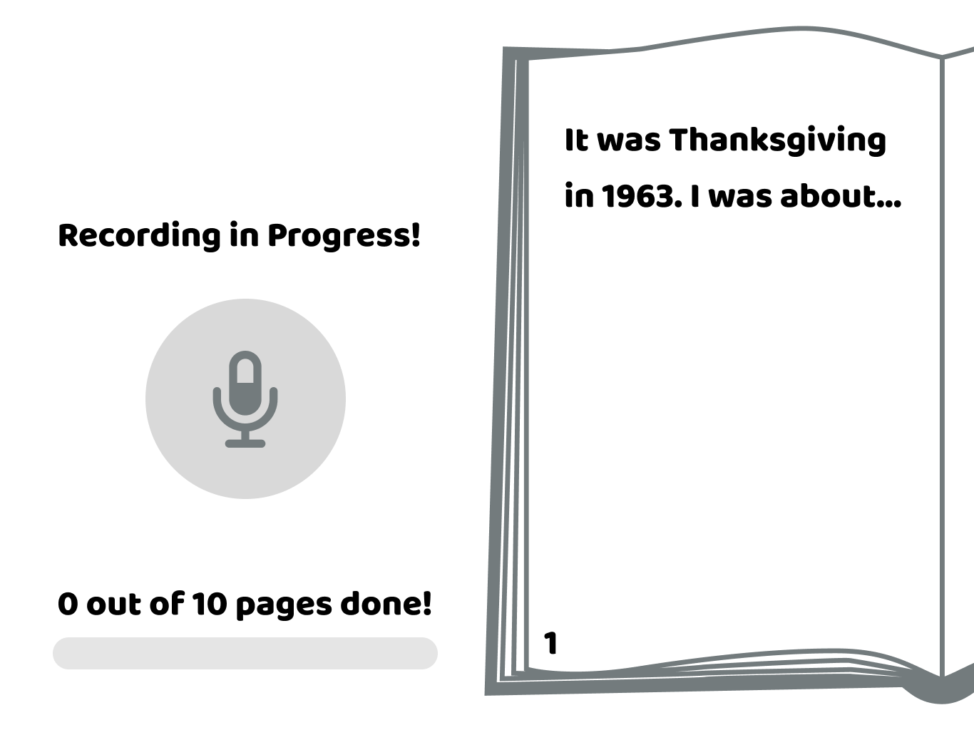
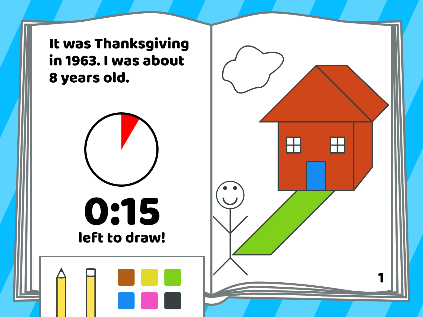
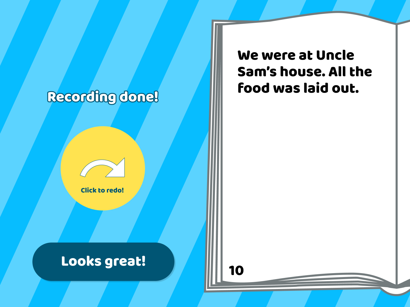
Once they start creating their story, the storyteller records the first page of the story, and the app transcribes the audio into text on the page. Taking into consideration that the AI may mess up the transcription or users may want to add more details, storytellers can re-record the page.
Storyteller flow
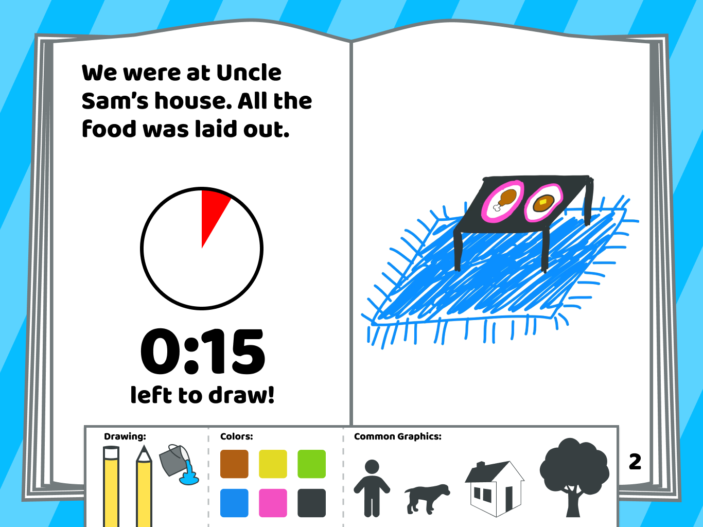
Once the first page is recorded, artists have three minutes to draw the scene using the tools, colors, and common graphics given to them. We decided not to give them infinite time to draw each page because that could cause them to spend too long on one page, which could leave the storyteller spending too long simply waiting for the artist to finish drawing and de-motivate users from finishing the book. A limited time to draw each page would also enhance the fast-paced, exciting nature of the storytelling, challenge artists’ creativity, and emphasize the importance of constant communication between the storyteller and artist. While the artist draws, the storyteller can see the art being drawn on their end in real-time, allowing the storyteller to give words of encouragement and feedback to the artist.
Artist flow
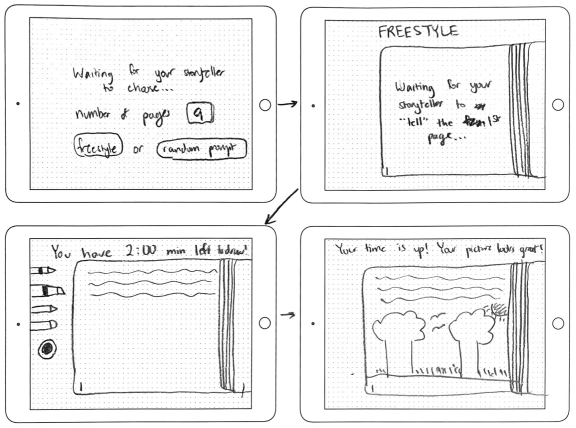
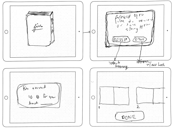
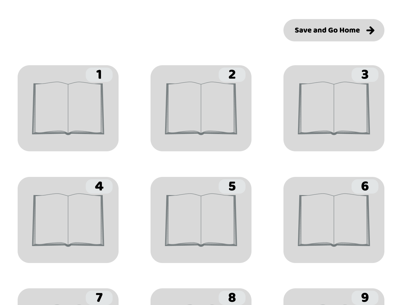
After three minutes are up, the storyteller can choose to add another page to their story or finish the book.
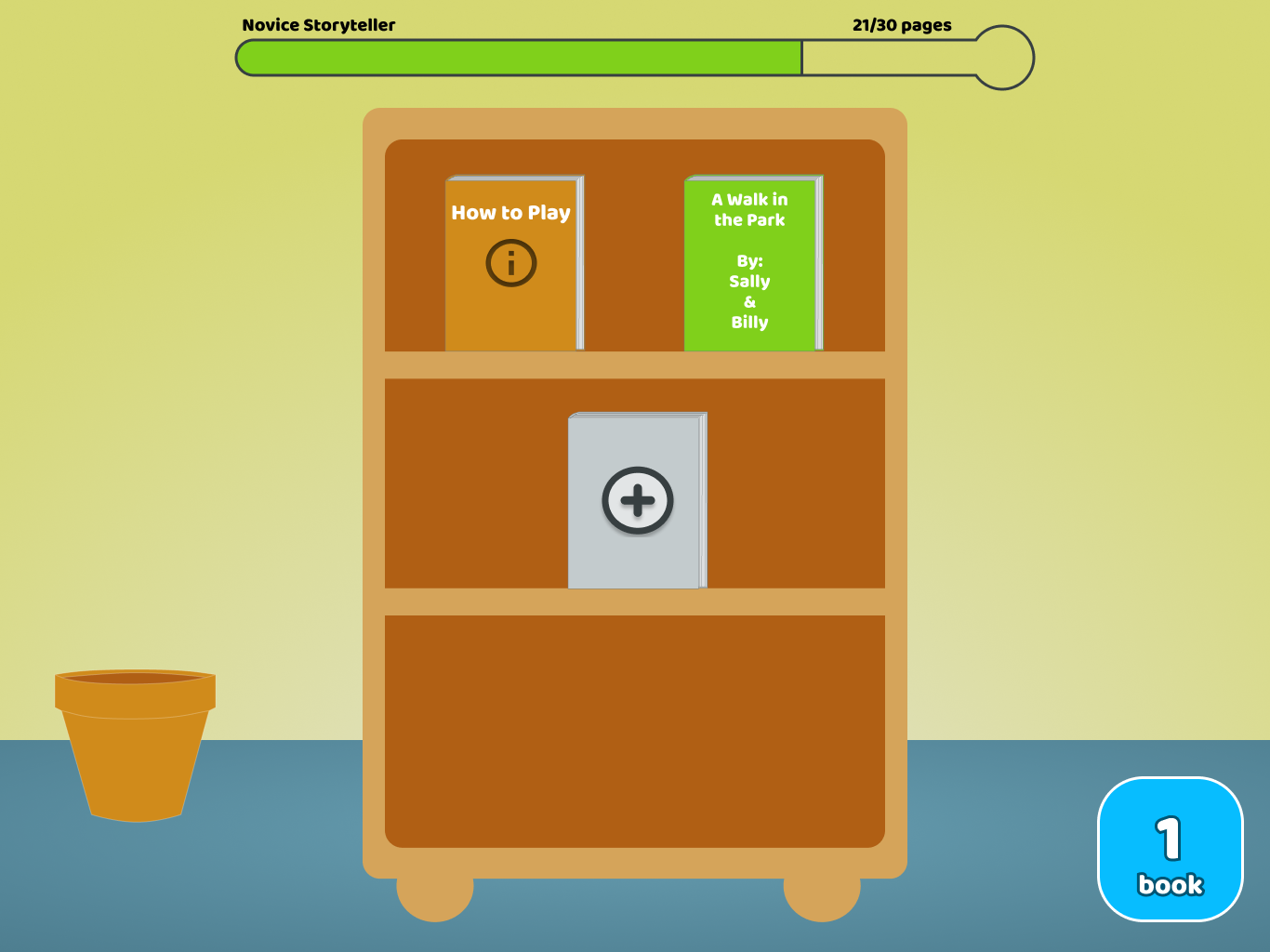
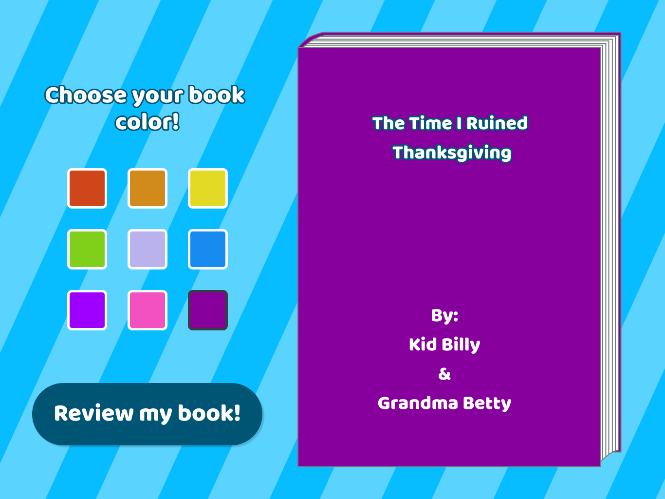
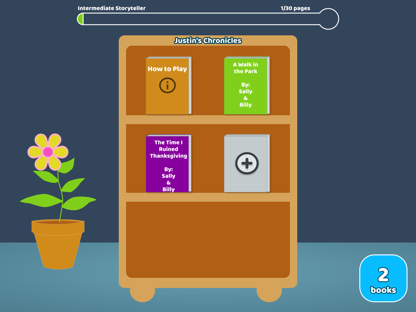
When they finish the story, they can enter the title of the book and choose the color of the book cover. When the book is added to their bookshelf on the landing page, the amount of pages in the book corresponds to the amount of experience points they gain, and they see the experience progress bar increase. As they create more books, the plant on the landing page grows taller and blooms more flowers, making the landing page more aesthetically pleasing and beautiful the more they use the app.
Ending flow
Turning our sketches into designs
We then turned our sketches into grayscales.
Landing page greyscale
Story set up greyscale
Artist greyscale
Storyteller greyscale
Ending greyscale
Creating a fun and playful app
We wanted our application to be fun and playful, yet at the same time not too childish as to deter older users from using it. We got inspiration from current market competitors for children’s tablet apps to get a sense of a kid-friendly UI. We concluded that bright colors and fun patterns for the background are essential, but creating a too chaotic or unorganized background pattern could be distracting and clash with the primary buttons and text on the screens.
A fun and playful moodboard
From the mood board, we began to play with different color schemes and background patterns, until we honed on an a primary and secondary color scheme to create a style guide, which is a document that dictates the colors, typography, call to action buttons, text fields, navigation elements, and iconography as a unified design language for the app.
Adding color and making our app cleaner
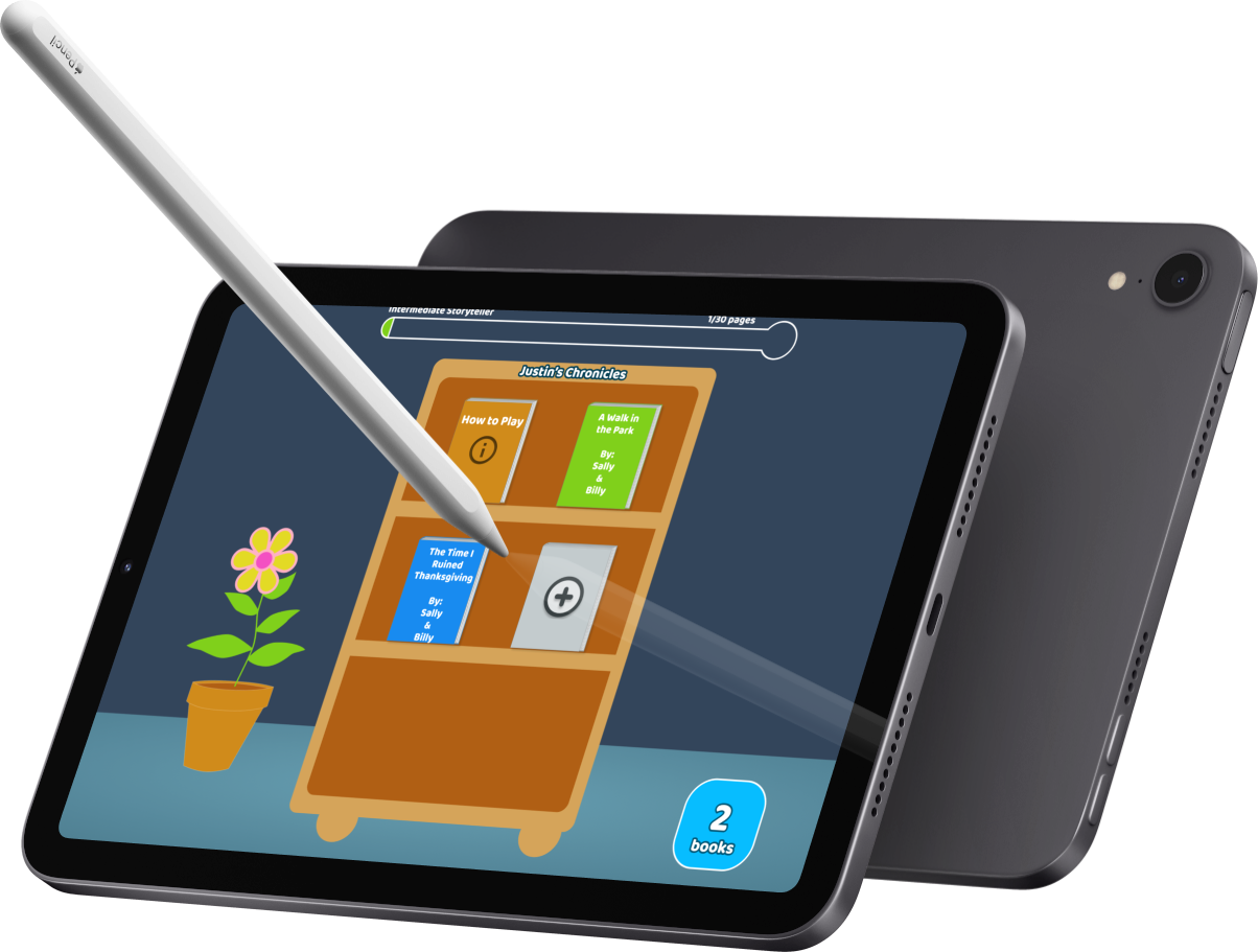
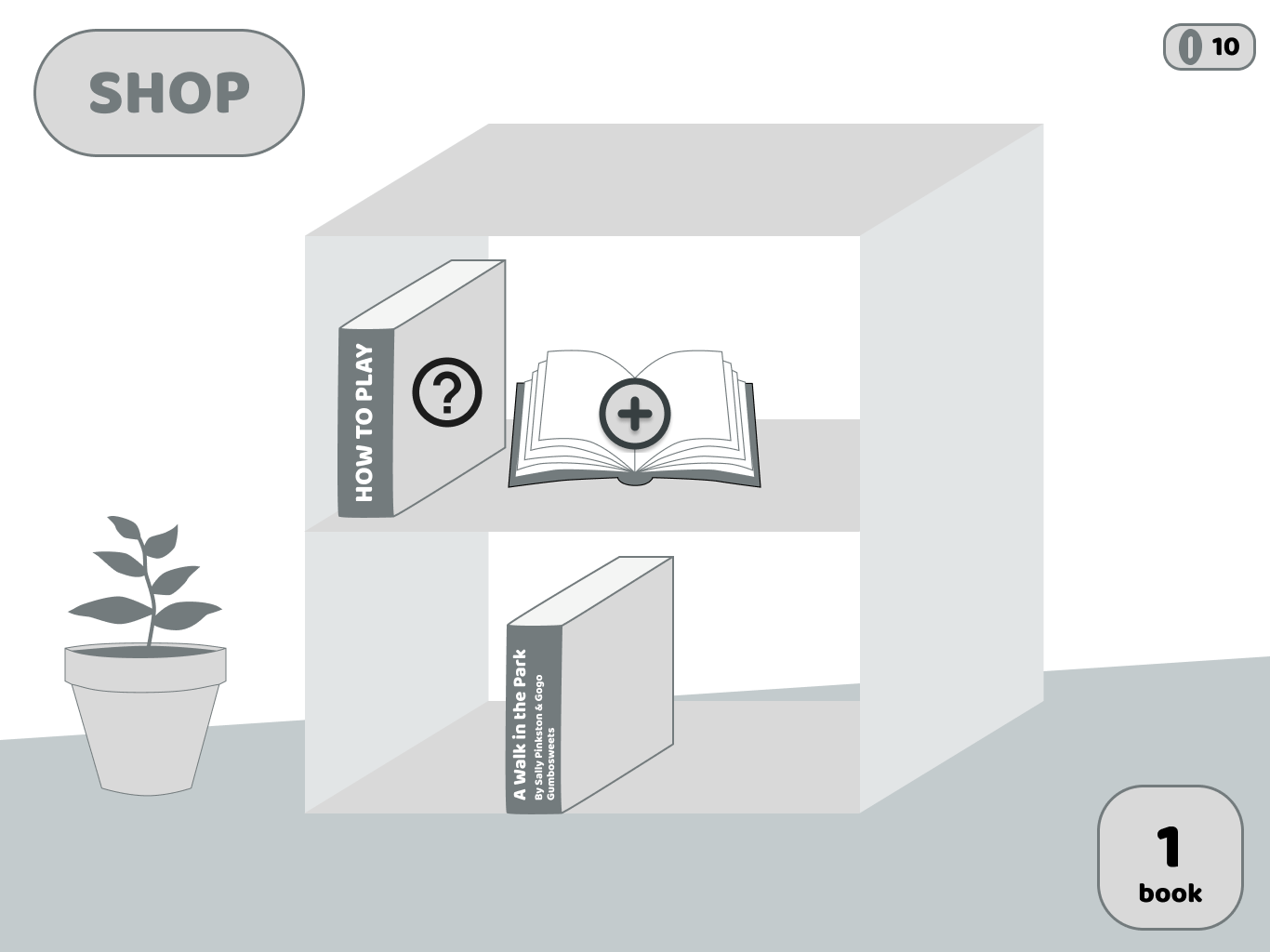
We decided to create a fun, engaging landing page as a bookshelf of the different books the user has created with other people on the app. The landing page has an experience (XP) bar at the top that incentivizes users to create more books so they can level up, for example, from novice to intermediate storyteller.
Empty state and landing hifi
Prompt choice hifi
Artist workflow hifi
Storyteller workflow hifi
End flow hifi
Bringing our HiFis back to our users
We posted our first draft of our prototype on UserTesting.com to gather feedback. We made sure that all of our users were grandparents by screening for users 55 years and older. Unfortunately, we could not test the app on children because UserTesting.com does not allow people under 18 years old to be users. We asked our users to navigate through different flows while rating the difficulty and intuitiveness along the way. At the end, we asked them several summary questions. From our user feedback, all of our users found the app incredibly easy to use and intuitive, but we also gained several key learnings that were the targets of our revisions.
1. Unauthentic Style
Users said the style of the app was unauthentic to what a kid would want. Furthermore, they felt that the vector art of the example artist’s illustrations were not what a kid would draw. We thus iterated the UI further to create a more joyful, bright color scheme and drew the art on an iPad and imported the graphics in to give the drawings more of an authentic look.
2. Graphics Tool
Users felt like it would be useful for the artist on the app to have some preset graphics to use in their drawings. We thus implemented some common graphics on the artist flow that users can drag and drop them into the page.
3. Reading Library
Users wondered where books they made that did not fit on the bookshelf would go. A reading library where users would see all of their previous books and be able to favorite books to put on their bookshelf.
Landing flow after user testing
Artist flow after user testing
Reflections
What we would have done if we had more time
If we had more time to work on this project, we would focus work on several parts of the app:
Reading Library
Implementing the aforementioned “reading library”
Graphics Tool
Extending the graphics tool to allow users to save their own graphics for later use
More Testing
Continuing to push our UI by conducting more user testing, especially on children
Lessons learned for the future
After pouring lots of time and effort into this project, we came out of it with many personal takeaways for future design projects. Here are a few of them:
Our users’ needs are typically not what we think they are
We initially assumed in our user research and ideation phase that grandparents would be motivated to share their stories with strangers to pass on life advice and wisdom to the next generation. We discovered in our interviews that they would be hesitant to do this, especially because older generations are skeptical of the implications of privacy and confidentiality with digital technology.
Designing the interface step by step can blind us to what may not be intuitive to first-time users
When we were designing the flows from scratch and working through multiple iterations of each screen, it can be easy to fall into the trap of thinking that certain aspects are intuitive when we’ve been building the design from scratch. It took some reflection and critical thinking to attempt to put ourselves in the shoes of a first-time user opening the app for the first time.
Disabilities can be reframed as vantage points for the design process
We are both color blind designers with deuteranopia and protanomaly, which made designing the UI more difficult. Thus, we relied on user testing and feedback from other designers to aid our UI decisions. In the end, our design ended up being colorblind accessible since it had to be accessible for us to design it!